
This is a picture of a gray scale which is a valuable tool for the artist to accurately judge the tone or value of the subject they are painting. It starts out with "1" as being the darkest (black) and ends with "1o" as the lightest (white). And, there are the ranges of light, dark and mid-tones in between.
Try to think of values in two distinct groups - areas of shadow and areas of light. The differences between light and dark help define shapes and show you what the light is doing. It takes practice to recognize correct value.
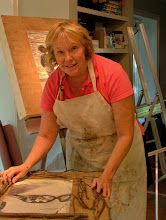
A helpful tool that Ellen White uses in her advanced class is to have her students take a black and white photo of their painting in progress and a black and white photo of what they are working from and then matching them to see if their values are, in fact, "correct".
Value allows the maximum contrast and can be used to control visibility and attention. Two major considerations are the amount of contrast (where the greatest dark against light occurs or vice versa) and the tonal range (the range from black to white). The highest contrasting area between light and dark enhances visibility and noticeabiltiy - hence the most efffective way of creating a "focal point". When this strong contrast is reduced, the visibility is reduced.
Definitions: Value? It is either light or dark. Hue? Each color has a name (I am not trying to confuse anyone here.)
But, please, avoid equal amounts of dark, mid-tones and light - boring. Variety is the name of the game.
No comments:
Post a Comment