 And, finally, when you have done all of the cylinders with curved lines to create volume, softened the contour lines about the cylinders, you begin to create your cast and form shadows. The cast shadows are the hard edge shadows that soften as they move away from the object casting the shadow and the form shadows are SOFT. This was Gary's five minute demo last week to his class on shadows...
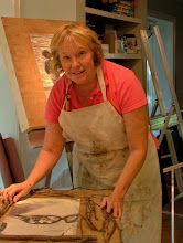
Monday, October 11, 2010
GARY WEISS - FIGURE DRAWING SIMPLIFIED
And, finally, when you have done all of the cylinders with curved lines to create volume, softened the contour lines about the cylinders, you begin to create your cast and form shadows. The cast shadows are the hard edge shadows that soften as they move away from the object casting the shadow and the form shadows are SOFT. This was Gary's five minute demo last week to his class on shadows...
GARY WEISS - FIGURE DRAWING SIMPLIFIED

Note how to line up with tracheal notch with other parts of torso - to umbilicus, nipples. And, the clavicles (collar bones).
GARY WEISS - FIGURE DRAWING SIMPLIFIED

Drawing reveals cyliner of upper arm, and use of circles and adjoining lines to indicate foreshortening. Rectangles indicate hand, mid-hand and fingers.
GARY WEISS - FIGURE DRAWING SIMPLIFIED

Note the cylinder of the chest with curved lines to indicate volume. Two circles indicate breasts, a triangle, the pubic area, and the beginning of cylinder of upper legs. Chin rests on chest.
GARY WEISS - FIGURE DRAWING SIMPLIFIED

Note cylinder of foot, curved lines revealing form. Rectangle suggest toes and curved rectangle for ankle joint with cut-out for lateral malleolus(protruding bone on outside of ankle joint).
GARY WEISS - FIGURE DRAWING SIMPLIFIED

Cylinders used for both upper and lower legs and direction of curved lines suggesting volume. Added knee joint and calf contour lines.
GARY WEISS - FIGURE DRAWING SIMPLIFIED

Again, with the use of geometric shapes, Gary creates a finger. Lower image of a pointing finger, although not easily seen, has a larger circle at the base of the finger and smaller circles at the middle and tip of the finger. Lines connect the outer edge of the two circles creating foreshortening. (Connecting lines are softened and reflect contour lines.)
GARY WEISS - FIGURE DRAWING SIMPLIFIED

I have been studying with Gary Weiss, a teacher at the school, over the past several months and find his teaching style easy to understand with the use of geometry shapes to make the figure make sense. The right image shows the upper and lower arm as two cylindrical shapes with curves in the same direction indicating the volume of the structure. The left image has contour lines used to indicate the curves of the muscle bellies. Note how simple the shape of the hand is made and that it reads "hand".
Saturday, October 9, 2010
MARGARET DYER - VALUE STUDY VS. LOCAL COLOR STUDY

Anne Meinert gets it right with a value study (on right) and then applies value principles with color (left).
MARGARET DYER DAY TWO STUDY

Note the volume that Sunny Walker has captured in this models figure with light, midtone, and dark values...
MARGARET DYER'S DAY ONE DEMO

LOOK at the beautiful color values that Margaret has used to create a wonderful study !!!
STUDENT AT WORK - MARGARET DYER WORKSHOP

Suzanne Jackson hard at work studying the model in her intial phase of the sketch.
MARGARET DYER MODEL IN NEW STUDIO

One of the three models the school had each of the three days in the new studio for larger participant workshops. Room for everyone!
MARGARET DYER WITH MODEL

Margaret Dyer discussing the day's expectations with one of our models, Irene.
MARGARET DYER PASTEL WORKSHOP


Get it right before you begin. Use loose grid to get your bearings and or a simple stick for relative measurements.
Tuesday, September 28, 2010
SCHOOL SPONSORED JURIED SHOWS AT THE GALLERY AT PAPER MILL VILLAGE CLOSES
A close to a wonderful year ends this Thursday for the juried shows sponsored by the school. The shows were simply fantastic and included the Georgia Photography Exhibit judged by Corinne Adams, the Southeastern Plein Air Exhibit judged by Bill Davidson, the Mixed Media/Collage judged by Kenson Thompson, the Palette Knife Exhibit judged by Angela Nesbit, The Portrait Society of Atlanta 2010 Juried National Exhibit judged by Dawn Whitelaw, the Atlanta Watercolor Exhibit judged by Marie Matthews, the Retro Americana Exhibit judged by Gary Bodner, the Atlanta Equestrian Exhibit judged by Robert Christie, and the Atlanta Pastel Exhibit jduge by Chin-Cheng Hung. Gorgeous works, wonderful judges!!!
Thank you all for participating and supporting this adventure!!!
www.thegalleryatpapermillvillage.com/
Thank you all for participating and supporting this adventure!!!
www.thegalleryatpapermillvillage.com/
Sunday, September 26, 2010
MAGGIE SINER - LET"S REALLY TALK COLOR!!!

THE RELATIONSHIPS OF COLOR VALUES - MAGGIE SINER

Comparing the relationships of colors...values, hue, and intensity...
We first determined the color of what Maggie calls "the largest piece of real estate" on the still life rectangle you chose to paint. You would then peripherally ;look to compare the color value relationship to a color a distance away, not directly adjacent to the area you just laid in. Try that a few times and your head really begins to hurt...it's not squinting... I admit, this was very difficult to do!!! We did this all day on the last day and you would simply be surprised how "off" value relationships can get if you do not follow this to the letter. And, when you tend to "forget" to use your peripheral vision, you get into major trouble with your color value relationships. The workshop was NOT about painting the objects but the color relationships of the subject areas of the still life. The objects will emerge and are dynamic!
The steps one can consider taking are:
1. Find the largest color value, then find your next largest piece of real estate and compare the value. Do this with a third area and compare the first two value colors with the third value color.
2. Find your brightest, lightest value.
3. Find your darkest values and let them merge.
4. Then find your local colors.
5. Do NOT paint objects; paint the color relationships and value. The objects will DANCE around the rectangle of your subject.
THIS IS NOT EASY!!!!!
MAGGIE SINER - WOW!!! WHERE DOES ONE EVEN BEGIN...???

Small, fit, trim, agile, and a bundle of energy, Maggie Siner jumped around, demonstrating movement within a painting with animated gestures of her hands and self and also how light explodes and travels through the works of masters. You could sense the intention behind these artists and in her own personal, powerful art work and you could feel her excitement for teaching what she feels is crucial to painting! She decided early on to sock it to us feeling we could handle what she had to say and we were all the better for it!!! We spent the weekend learning, yes learning, the basic fundamentals about the relationships of color, how to translate value into color, understanding intensity and saturation, seeing the color of light, the color of shadows, and hearing this eloquent woman speak and share her infinite knowledge, wisdom and humor! Having taught internationally, Maggie has studied and taught on an international level. We were lucky to have her come to Atlanta and have begged her to come again and already a list is forming!!! Dramatic is how I would describe her work and explosively dynamic I would describe her teaching style...she is a MUST for any level learner!!!!
Wednesday, September 22, 2010
NOT MEANING TO BEAT A DEAD HORSE...(poor use of words since I own and LOVE horses!!!)
As an additional note to the previous post, here is a letter that one of the students of the school received this week as a result of work she posted on _______.com.
'Good Morning ___________,
We received your letter today and believe you deserve an explanation.
First of all, you were not being singled out for your actions. Our Intellectual Property attorney has filed more than 150 complaints with _______.com regarding improper or unauthorized use of our trademarks. Please understand that we must address trademark and copyright violations or run the risk of losing them to public domain.
This is nothing different than any other owner of a valuable property would do to protect their rights. Examples: If you painted a picture of a "Coke" bottle and titled it "Coca-Cola", you would hear from the Coca-Cola company. If you painted a picture of Mickey Mouse and offered it for sale, you would hear from Disney. Other well known images such as the Chevrolet "Bow-Tie" or the "Nike "Swoosh" would bring the same response.
We don't claim universal ownership of the "fiesta" word. We do, however, own the rights to the word as it relates to ceramic dinnerware.
...For the protection of our valuable brands, we must seek out and attempt to stop those who would profit from the popularity of our brands without our knowledge or authoriztion.
A WORD OF CAUTION, FOLKS!!!
Sunday, August 22, 2010
A NOTE ABOUT "COPY CAT-ting" - A HOT TOPIC!!!

Art students everywhere are, at one time or another, asked to begin taking their own photographs or using personal visual and mental experiences as source material from which to create a work of art. New students often study masters and other instructors' works to learn technical skills in handling tools and equipment, to learn about design, composition, color and application in creating an effective work of art - learning to walk before they can run. As a student begins to develop these necessary skills, they should begin using their own source materials and experiences to create art work.
A fine line must be drawn when students copy another's work and sell that work for gain and/or recognition. Not only are some artists dismissed from galleries or art show competitions for suggesting an original when in actuality it already exists, some are now being sued. At a workshop held outside of Atlanta that I attended earlier this year, the entire group was instructed to ask permission to paint another group's still life set up due to the issue of plagarism.
.
I think it is important to begin with the definiton of "plagarism". Plagarism is the act of copying the work of another and representing it as your own. The opposite of plagarism is, then, "creativity" and "originality". Students should employ the skills learned in classes and workshops to create their own style which should vary significantly from the style of the teacher or master.
So, be careful, students...be wary of plagarism. It is an ethincal issue and in some cases can be a legal issue.
Sunday, May 9, 2010
PEGGI KROLL-ROBERTS - THE FIGURE IN LANDSCAPE


California's Peggi Kroll demonstrates how to achieve value of the figure in landscape in 25 brush strokes or less.
THE PORTRAIT SOCIETY OF ATLANTA - TOP THREE WINNERS

First: Casey Baugh, Chattanooga (middle)
Second: Donna Colleran, Atlanta (right)
Third: Jon Houlgrum, NC (left)
Lora Hill, main organizer of this event, reaching on the far right.
THE PORTRAIT SOCIETY OF ATLANTA - RECEPTION AT THE GALLERY AT PAPER MILL VILLAGE

Whoa! What a crowd we had last night for the opening reception for The Portrait Society of Atlanta's 2010 Spring Juried Exhibition (judge: Dawn Whitelaw).
If you want to see what some of the leading southeastern portrait artists are up to, please visit the gallery during the month of May. The show will end just before Memorial Day weekend. Some pretty amazing work.
We are privilieged to have as first place winner for his "Luminesce", Casey Baugh, from Chattanooga in the show with two of his other works. They are stunning to say the least. What a promising career this young man has ahead of him! Check out his web site. http://www.caseybaughfineart.com/
RAY ROBERTS - END OF DEMO WORK

Ray stopped his demo so that the group could paint, but this is where he ended his demo...note the lead in with the pink flowers to the vine on the fence to the side of the house in the back, across the roof and finally resting in the focal area of the limbs and side of the house. Ray successfully led the eye through the canvas to his focal area - something we also witnessed in Ken Auster's demo...these guys are masters at this!!!
RAY ROBERTS - CROSSING OVER AND CHANGING TEMPERATURE

In this close-up picture of Ray's demo work, note that when limbs crossed over from the warm white side of the house to the cooler blue shadow side, the limbs changed from a warmer color to a cooler color when entering the shadow.
Talk about temperature knowledge and being able to see what is going on in nature! Whew! This is a hard concept to grasp, for sure! But, look at how the tree comes to life...
Of course, in this study, it is more exaggerated for the lesson...per Ray...
RAY ROBERTS - LAYING IN DESIGN WITH VALUES

Ray laid in his design with lovely gray values...and then he painted directly on top of it with color to hold true to his original values. He did a demo of what would hapen if he veered off his original design and value range and it truly destroyed the painting. Hold true to the values you see!!!
CALIFORNIA'S RAY ROBERTS - DEMO AND DISCUSSION

If I had to choose a title of yesterday's workshop by Ray Roberts, I would call it what he wanted the class to learn - "Design in Black & White, Paint in Color". Here, Ray demos how to block in shapes in black on a white canvas.
A few "pearls" he shared with the group:
1. When dealing with a large area of light and a small area of dark, make the dark area more luminescent (i.e., the eave between a roof and side of house (eave needs to be more luminescent); a large mass of light blue sky and a dark silhouette of tree leaves (leaves need to be more luminescent).
2. Asking, "Why a color is the color you see?" The answer: Look for what color is being reflected from an object (i.e., blue on the side of a white house reflects the blue sky, green on the side of a house reflects the light bouncing off the grass or bush)...
3. "Think in values, but do it in color."
4. "Anything in light is lighter than anything in shadow."
5. "If you change your original values from your black, white and gray study, your painting will "go south" in a hurry! (We had a great chuckle over this given that they are not from here!)
6. Typical order of focal points in a painting that the viewer gravitates towards: First, people; then animals, structures, flowers and, lastly, the landscape.
7. Have a variety of mechanical, organic and unequal shapes..."dot, dash, dash, dot, dot"...
8. "Err on the side of warm."
And then Peggi Kroll-Roberts added a tid bit of knowledge: "When in doubt, take it out!"
I will have to say that these two are delightful as a husband and wife team. They have fun together; their sense of humor is wonderful and they play off each other...FUN, FUN, FUN!!!
Saturday, May 8, 2010
PEGGI KROLL-ROBERTS WORKSHOP

We are so fortunate to have both Peggi Kroll-Roberts and her husband, Ray Roberts, visit Atlanta for a workshop hosted by the school. This photo exemplifies Peggi's study of values of the figure in landscape.
The workshop included:
Day 1: Still Life (Peggi)
Day2: The Figure in Landscape (Peggi)
Day 3: Plein Air Landscape (Ray)
PEGGI-KROLL ROBERTS WORKSHOP AT THE GALLERY

Students participating in the Peggi Kroll-Roberts Still Life Workshop at The Gallery at Paper Mill Village.
Note: The Portrait Society of Atlanta is exhibiting at the gallery during the month of May.
PEGGI KROLL-ROBERTS - GIVING GUIDANCE TO A STUDENT

Peggi offers "undivided" attention to every student participating in the workshop - a kind and gentle approach.
USING A HAND MIRROR

Peggi Kroll-Roberts instructs in how and why to use a hand mirror in looking backwards at what you are painting - to insure that you are capturing the correct likeness of your still life or subject - angles, shapes and relationships.
PEGGI KROLL-ROBERT'S VALUE STUDIES - DAY 1 OF WORKSHOP

First: Black and white
Second: Balck white, and gray
Third: Local color application

INSTEAD OF AN APPLE A DAY...HOW ABOUT A SKETCH A DAY!

Peggi shares her beautiful sketch notebook...every workshop instructor has stressed how important it is to sketch at least one thing a day...
PEGGI KROLL- ROBERTS VISITS ATLANTA

Peggi Kroll Roberts of Angel Camp, California and one California's leading artists speaks of value, value value... The workshop group first worked in large black and white shapes, then in the second study we added gray. Then we applied the principles learned to color studies.
Sunday, May 2, 2010
ARLEEN TURZO JOINS TEACHING STAFF

I am thrilled to announce that Arleen Turzo, an incredibly gifted artist who is locally represented at Lagerquist Gallery, will join our instructor panel. She is offering a workshop on September 11 and 12 on palette knife technique taking into consideration color harmony, how to use the knife to achieve different effects, working with a sophisticated gray and colorful palette. Note this painting, "Neutrals and Roses", in how Arleen depicts the shadows. These have been beautifully handled. Exquisite palette and technique indeed!!! http://www.arleenturzo.com/
Wednesday, April 21, 2010
THE PORTRAIT SOCIETY OF ATLANTA JURIED SPRING EXHIBITION
JOIN US FOR THE PORTRAIT SOCIETY OF ATLANTA'S JURIED SPRING EXHIBITION
Opening reception: Saturday, May 8th, 6:00 - 9:00 pm
The Gallery at Paper Mill Village, 255 Village Parkway, Suite, 320, Marietta, GA 30067
Judge: Dawn Whitelaw (Tennessee)
Show dates through May 28th.
Opening reception: Saturday, May 8th, 6:00 - 9:00 pm
The Gallery at Paper Mill Village, 255 Village Parkway, Suite, 320, Marietta, GA 30067
Judge: Dawn Whitelaw (Tennessee)
Show dates through May 28th.
GARY BODNER - ALWAYS ONE TO SUPPORT THE ARTISTS!

Donna Thomas, Angela Nesbit, and Gary Bodner sharing a KODAK moment!!! We hade a great evening at The Gallery at Paper Mill Village.
MERIT AWARD WINNERS - PALETTE KNIFE EXHIBIT

Judge: Angela Nesbit, Gallery Director, Donna Thomas, Melissa Payne Baker, Beth Stormont, and Arleen Turzo. Missing: Maureen Engle, Julie Mann, Patricia Meyers.
MERIT AWARD WINNERS - PALETTE KNIFE EXHIBIT

Melissa Payne Baker (award winner) and Beth Stormont (two time winner) stand with Beth's husband, Jim, in celebrating an exciting opening reception for the Palette Knife Exhibition.
ANGELA NESBIT - JUDGE FOR PALETTE KNIFE EXHIBIT

The Gallery at Paper Mill Village is currently hosting a palette knife exhibit which Angela judged for merit awards. One of the recipients is of the painting behind her, that by Arleen Turzo who attended her workshop, "Roses & Neutrals".
ANGELA'S GROUP

The entire group enjoyed Angela's style of instruction. She was able to give every student ample instruction in palette knife technique...

ANGELA NESBIT - PREPARING FOR PALETTE KNIFE WORKSHOP

Selecting the best flowers for her bouquet demo...a real challenge for .


CITY LIGHTS - AUSTER

The warm and the cool side of the street....amazing!!! He brings life to people out of dark splotches of color!
ALIEN COLOR - KEN AUSTER

Ken Auster's first demo...with alien color (in this case phthalo blue) and all in the bell tower... how he wormed his way through with value lines to direct the eye to the focal point...he discussed having the ability to take a viewer exactly where he wanted to take them with line, color, detail and contrast...the focal point which is where he begins his paintings in making a road map the first fifteen minutes to lay out the design.
FROM THOSE BLACK BLOBS OF PAINT...

The finished Ken Auster product! Finished in about an hour...
A phrase Ken used over and over again...if it is "not working" in the first 30 minutes, start over!!!
Subscribe to:
Posts (Atom)