
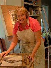
If I had to choose a title of yesterday's workshop by Ray Roberts, I would call it what he wanted the class to learn - "Design in Black & White, Paint in Color". Here, Ray demos how to block in shapes in black on a white canvas.
A few "pearls" he shared with the group:
1. When dealing with a large area of light and a small area of dark, make the dark area more luminescent (i.e., the eave between a roof and side of house (eave needs to be more luminescent); a large mass of light blue sky and a dark silhouette of tree leaves (leaves need to be more luminescent).
2. Asking, "Why a color is the color you see?" The answer: Look for what color is being reflected from an object (i.e., blue on the side of a white house reflects the blue sky, green on the side of a house reflects the light bouncing off the grass or bush)...
3. "Think in values, but do it in color."
4. "Anything in light is lighter than anything in shadow."
5. "If you change your original values from your black, white and gray study, your painting will "go south" in a hurry! (We had a great chuckle over this given that they are not from here!)
6. Typical order of focal points in a painting that the viewer gravitates towards: First, people; then animals, structures, flowers and, lastly, the landscape.
7. Have a variety of mechanical, organic and unequal shapes..."dot, dash, dash, dot, dot"...
8. "Err on the side of warm."
And then Peggi Kroll-Roberts added a tid bit of knowledge: "When in doubt, take it out!"
I will have to say that these two are delightful as a husband and wife team. They have fun together; their sense of humor is wonderful and they play off each other...FUN, FUN, FUN!!!
No comments:
Post a Comment